VaultNetwork.netVault Network Boards
Author Topic: EggiSohwyn's UI v1.10 [Locked]
eggi541  1 star
Posts: 95
Registered:
I am uploading and update. It will still have the name eggisohwyn's since everyone knows it by that. I have a few new features and will be starting a new vn link for it. I will post the link here. once I have it ready for download. I did new screen shots for almost everything in the ui. It will be a beta at first.
i still have to create the info for the seige crafting I have the tab made just the buttons for info do not work at the moment. I also redid the artifact window.


Ui is uploaded and ready for downlod here is the link to the new vn board link.

http://vnboards.ign.com/user_interface_board/b22592/114820094/p1/?0
Dhad
Posts: 6
Registered:
sorry, need 20 posts
eggi541  1 star
Posts: 95
Registered:
New link with the Mythic style Market Explorer key word box fixed.
Igorod
Posts: 2
Registered:
Anyone else having issues with the last 7 or 8 characters in the journal being cut off on each line? I've tried with multiple resolutions, full screen or windowed, and 2 computers and the same thing is happening.
Ganelf
Posts: 12
Registered:
I'm having the same problem.
eggi541  1 star
Posts: 95
Registered:
I have issues with the journal, but I have the same issues with mythics ui. Resizing it and the scroll bar gets weird. I have tried several things and nothing fixes it. As for as text missing if I resize it I get the text. Which font are you using?
therinS  1 star
Title: Camelot Vault Staff
Artist

Posts: 161
Registered: 2006-1-4 04:27:28
I was having font-resizing issues, but that seems to have been fixed with the latest version. However, I now have a different problem.

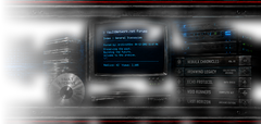
Most of the fonts I select via the Option Chooser (both True Type and Targa) do not look correct in the chat window, though they look correct in the paper doll window text and in other windows (/social, /rw, etc). I would describe them as blocky, oftentimes not looking like the font chosen at all, more like the 'Fritz' font.

I took screenshots of all the True Type fonts in game in case you need some visual indicator of what I am talking about.

Here: https://www.dropbox.com/gallery/3541098/1/Bad%20looking%20fonts%20True%20Type?h=914487

The fonts in the Targa options also had issues, most looked bad but a few were ok (no screenshots of those).

I did try changing the Skins/Dialog Skins to several different kinds to no avail - the bad fonts still looked bad.

On a non-font related issue, under Skins/buttons/xMythic, the Classic Alb and Classic Mid options are the same shade of grey, with no apparent color applied to them, unlike the Classic Hib, which looks like it is supposed to. Also, the Classic under that same catagory has light blue colored tabs when you choose a tab in the windows, as opposed to yellow like the rest of them. Not a bad idea, but it does not seem to be used in the other options. Is that the way the Classic is supposed to look?


-----signature-----
Eggi/Sohwyn custom ui download site
BETA http://www.4shared.com/archive/LllGqvhe/eggisohwyn1110dbeta_1_.html
(:^
I will stop procrastinating tomorrow.
DAoC desktop calender collection http://db.tt/GnHh5Sc
Igorod
Posts: 2
Registered:
I'm using Mythic MyriaPro (true type), my girlfriend is using Arial and tried Verdana(targa). We've tested Verdana and Arial (true type) as well, on a desktop and a laptop. We both have the same issue with the journal with words at the end cutting off. I can get screenshots or do further testing if desired. Let me know if you want to contact me in game or externally somehow. Glad to help where I can.

VaultNetwork.net is an independently operated community forum and is not affiliated with, endorsed by, or technically based on IGN, GameSpy, FilePlanet, GameStats, or the former IGN/GameSpy Vault Network.
References to VaultNetwork.net mean this site/domain. VNBoards-style presentation is a visual homage only. By using this site, you agree to the forum rules.