| Author |
Topic:
Ghost UI version G [Locked] |
|
|
Date Posted:
1/1/00 12:02am
Subject:
Ghost UI version G |
|
There are pics on the UI's page. link to the page is in TheTK's sig. You'll have to scroll down the page for older versions if you want more pics. Unless there have been major changes, the older pics should still be relavent.
|
|
|
Date Posted:
1/1/00 12:02am
Subject:
Ghost UI version G |
|
|
|
|
Date Posted:
1/1/00 12:02am
Subject:
Ghost UI version G |
|
That dont look like ghost UI. Never seen those ugly HP bars etc in ghost ui before...
<<
There are pics on the UI's page. link to the page is in TheTK's sig. You'll have to scroll down the page for older versions if you want more pics. Unless there have been major changes, the older pics should still be relavent.
>>
No such pics anywhere, and I have tried several versions of his sig link.
JH_man
|
enfi Posts: 6
Registered:
|
Date Posted:
1/1/00 12:02am
Subject:
Ghost UI version G |
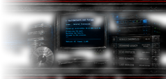
So you ask for a SS of the UI, and then when someone posts one you say "That dont look like ghost UI."
You really are something....
http://tknd.phpwebhosting.com/ghostui/ghostui.xml
THE SS ARE RIGHT AT THE TOP!!!!!
You really suck at the internet...
Edit: I'll even post the pic that's on the page, just in case you get lost.
http://tknd.phpwebhosting.com/ghostui/sshot_gfull.jpg |
|
|
Date Posted:
1/1/00 12:02am
Subject:
Ghost UI version G |
|
" That dont look like ghost UI. Never seen those ugly HP bars etc in ghost ui before... "
well it is. sorry?
|
TheTk  Posts: Posts: 66
Registered:
|
Date Posted:
1/1/00 12:02am
Subject:
Ghost UI version G |
|
I don't like to make promises but there probably will be another update to my UI.
The latest update included an overhaul of some background things so the next updates should be less painful. I do have plans to open up the UI to accept other's work given some restrictions. I think the UI has gotten to a point where now everyone is starting to submit more tailored suggestions. Some suggestions are useful for everyone of course, but I'm starting to see people customize the UI themselves. I have no problem with that, I'm just saying that in the future the UI will be easier to "add on to" without my involvement.
Just looking at screenshots of the UI for different people, I already see lots of variability. For me it's always interesting to see how others setup their UI and with GhostUI and there have always been BIG variations between users. But that was the intent of the UI after all: to be one of the least intrusive UIs yet highly usable.
|
|
|
Date Posted:
1/1/00 12:02am
Subject:
Ghost UI version G |
|
Well I think you've certainly excelled there, Teek. I can make your UI as uninstrusive or cluttered as I need to. I think at this point most of what you'll be doing is optimizations and/or updates, as you've got all the features I can think of adding. Kudos on a geat UI.
|
|
|
Date Posted:
1/1/00 12:02am
Subject:
Ghost UI version G |
|
great ui man... however i would really love to have the option to change the target color to red
could you perhaps think about adding a different floating target perhaps a bit smaller/sleeker with the option to change between red/blue in the options app? Or... be able to change between red target color and blue on personal health?
i am colorblind and the purple con targets are really hard to read the name on.
|
|
|
Date Posted:
1/1/00 12:02am
Subject:
Ghost UI version G |
|
Really *love* the UI ...
Edit: That problem solved, was being a spacca!
Also any option to get a different compass? Your UI is really sleek and streamlined except for the big bulky compass! Any way I can get the default compass?
|
|
|
Date Posted:
1/1/00 12:02am
Subject:
Ghost UI version G |
|
the best ui - great job :>
|
|